Project One.
In this section I am looking first at sketching individual trees. Before starting on this I took a number of photos. I am fortunate to work near a park and at lunch so I was able to walk and photograph a number of trees. I did not worry about identifying single trees too much as I wanted to understand the big shape of the trees. It is also worth noting that in these photos and sketches I was only able to look at trees in spring and early summer. Trees of course look vastly different in the seasons. A tree in spring is full of bud and growth where as in summer the leaves often obscure the branches with thick clumps of leaves. In autumn the colours change and the branches are exposed again. In winter the trees stand in cold skeleton like structures.


I moved on to sketching a number of trees and outlines but whilst doing this I looked back over some of my art books at the handling of depicting trees. From the early day Botticelli simplistic style with the leaves painted with outlines on as below.

To the ethereal quality of Rubens with their soft leaf structure which reminds me of Constable here the trees we painted in a more reconsible format for modern tastes.

This was developed further when the Impressionists painted impressions of what they saw. Here the paint is applied in patches of colours and left rough unfinished creating the shape and the mood of the trees rather than the exact image. Here in Alfred Sisley we can see this in slightly less well known than a Manet of Monet.

Exercise 1. Page 59
So I began my sketching. I have tried a number of variances from the impressionist style to a more detailed. Whilst this section is looking at individual trees I have sketched groups to start. I varied having the trunks light which I feel capture the way light bounces off the trunk. When I look at a tree the trunk stands out because of the lack of shadow which the foliage is affected by. The way sunlight hits the bark lighting one side. Working in pencil allow me to build up detail . I have used the pencil to try and capture the flowing nature of willow trees.


I also began work using charcoal as I had in section 2. Some leaves stand out like small highlights of light. I worked to create a difference in tone making sure my dark is very dark and then highlights using an eraser. I did this to create depth and to try and create the same sort of shape and depth or at least an impression of the trees like Sisley.

Excersise 2. Study of individual tree. Page 60
I moved onto an individual tree. This tree is at the end of our drive so was easy to sketch. Remembering the work I had done on the other sections I paid particularly note of the foliage. I used a blunt charcoal stick to mark the curves and the way that the leaves are formed.
Again I used the technique to lift out shadows of light pushing this further after I read in a book on Carivigo he said that the strongest light means that on the strongest part of light you cant actually make out. It isn’t the shadows and shades that show the form of the shape.

Project One. Excercise 3 study of several trees p61
Moving onto a group of trees and foliage I chose a path in a wood nearby to me. It was early morning and the sun wasn’t filtering through the trees. I decided to use charcoal to continue to develop what I had leaned so far. I also wanted to try someone new. I think some of my early drawings had resulted in a little middle ground muddy. So I moved to try and reduce drawing when not needed. I shaded most of the paper I was using in a light charcoal blend, fixed then moved onto the tree trunks. These I left the left hand side of the tree subjecting the sunlight side wiz n abscence of drawing. I then moved the right hand sid to get steadily darker the further right they go. I used a blunt charcoal to work on the tree foliage making sure I moved all the leaves in one direction as there’s was a gentle breeze right to left making the branches move. After fixing this I worked back by using an eraser to highlight to etch out the leaves. I like the freshness that is kept in is piece by the lack of charcoal on some parts.

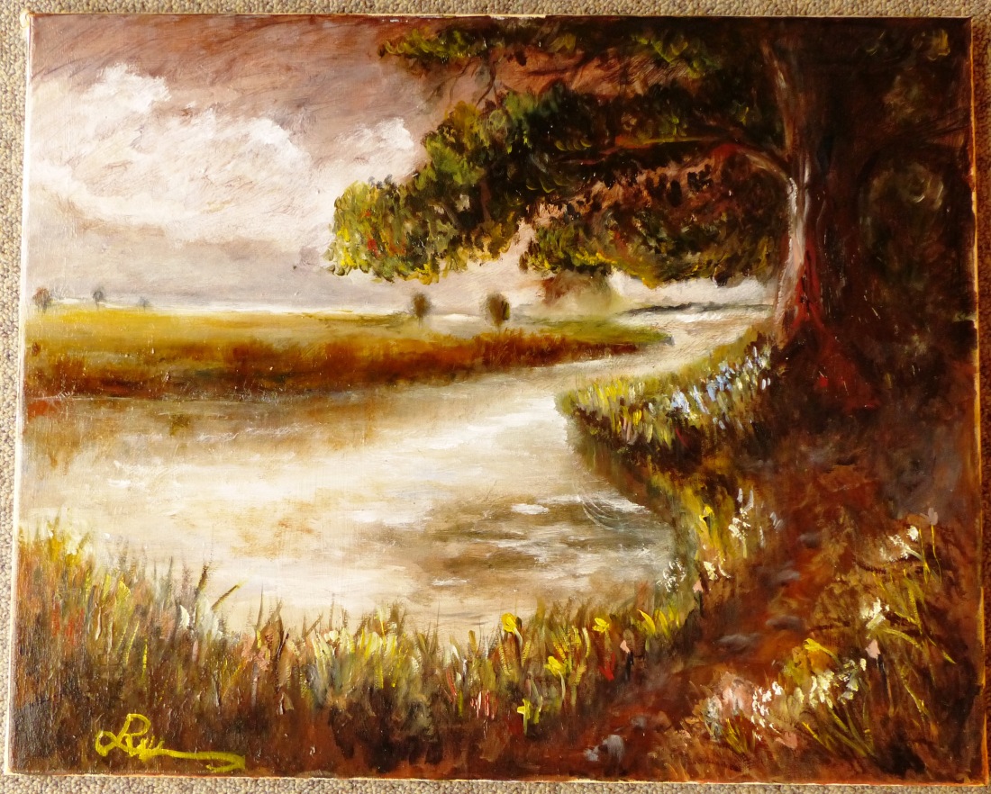
I also produced an oil painting here I worked on the many colours the texture of the tree trunk, the sway of the long grass and the smooth of the river. Here I tried to capture the feel of the trees that Constable gets with a classical evening light feeling.
Inspired by
Reflection on Project One.
:Charcoal again seemed good. I tried a new way of working to try and ensure the tones are correct and the highlights are highlights and the darks are dark. I did a basic tonal sketch and then sprayed with fixent. I lifted then with an eraser light areas and fixed again. I then after fully dry worked with charcoal over the darks to dakern then a final fix spray.
:The work on the branches in pencil I feel catches the form, the shape and curves.
:Barks need more texture but need to be kept clean less lines.
:Leaves need more detail more lift and shade.
Please see my sketchbook for original copies of these sketches and additional sketches.
See also my notes/research section at the bottom of my front page drawn from the magazine International Artist in regards to landscape work.
Section Two. Landscape.
Research.
The landscape has been projected by different artists through the ages. When you look back as far as artists from early renaissance such as Ambrogio Lorenzetti as pictured here, you can see perspective was not developed and paintings were done to suit the church so often had a biblical phrasing to them.

This developed and in the classic barooque era you can see that airel perspective has been developed and the subtle of lighting is modelled advancing the art of landscape. indeed Turner was I believe inspired by Calude’s work and I believe you can see it in the simular handling of the lighting in one of Turner’s great pieces of work.


Of course there are endless landscape paintings to study from the inclusion of landscape in T Gainsborough Mr and Mrs Andrew to show their statusto Constables beautification of the landscape and Van Gough’s vivid landscapes and each genre/artists need to be understood in context of time and location to truly understand the paintings which in itself takes would take years of study to understand.
Looking at Vija Celmins work and listening to here explain how she produces the pieces was fascinating. Again she is simply taking one object such as the sea and re producing it again and again in stunning quality but it is still just the sea. Her work is almost hypontic because it is so simple and yet forces you to look at objects that you have seen many times but not really seen them. I think I can take simplicity into my work, there doesn’t need to be tricks or things to distract you. If the image is of a path going through a wood it is an image of going through a wood.
Exercise one.
Moving onto clouds I produced sketches of clouds. Here I started by flicking through an impressionist books here I discovered these pictures.


In Turner’s painting you can see the way that the clouds hang over the land creating shape and form over the land. In Constables you can see the swirl of the cloud the way that shadow is in the base of the cloud but has a 3 dimension to it. In Paul Grimm’s painting the clouds have more of a conventional feel to it as the clouds are rounded and fluffy but they still have a feel of 3d.
I moved onto sketching using a combination of lifting out with eraser and fixing then going back over with more charcoal. I tried to get the dark in layers so that as viewer you don’t just see a flat surface. I moved onto produce for part two a large a2 piece which emphasized the clouds. Again I etched the main shape of the clouds using eraser and blacked in. I then discovered my fingers had marked the piece but I started to like this. So using my fingers I swirled the clouds to create a 3d effect. On the ground bellow I worked on the lighter areas with just a light sweep of a flattened charcoal stick.
Project 2, exercise 1 p64. Cloud study. Please also see sketchbook for other sketches.

Project 2, exercise 2 sketchbook walk p 65.
I worked on sketches outdoors. I did this work on a hot bank holiday weekend at a campsite in Woodhall Spa. I had not bought any charcoal with me so i was forced to use graphite pencils with burnishing sticks. Having never used these before I think that I will try and use them more often.
On my first work I struggled to make the shades different. I like the way that the trees trunks you can capture the almost shimmer of the wood and with a small amount of marks create the surface of the wall facing the sun.
I then worked on a tall portrait snap of the towering trees. This is less effective the detail is missing and their is no proper sense of light. Working on the final piece of our electric cable in front of the foilage to the back of our vans I feel this is much more effective. The cable is possibly too striking but I like the way the trees at the back fade back. The stones at the front I think work well along with the grass, the stems growing longer the closer they come towards you to emphazise them appearing bigger.


Project 2, exercise 3 360 study p66
++++++++++++++
Reflection Project Two.
Here I think I have learned to observe. To understand that clouds are 3 dimensions, when you look at a cloud you can see through some of the white to see the shadows underneath. the way light catches on the edge of a cloud and makes it transparent. To look when walking about and how quickly a small sketch such as the trolley and cable sketch can fill a page with detail that as you draw you see more detail. My drawing still lacks some prescion and needs to be neater in some areas this is something I shall work on.
Research.
I have already made comment about the way that some classical painters have produced work in the landscape but to look at painters from Impressionist to more modern we can see work developing. From Monet’s path through the cornfield where the literal realism has given way to a softer feel

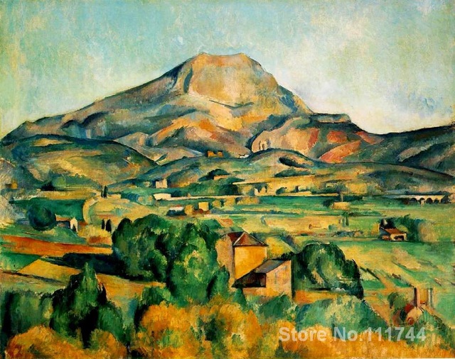
Cezanne moved this forward pushing the landscapes into deeper abstract art. His painting of Mont Sante Victoire still has defined landscape images but pushes the boundry.
Work by Hockney and Doig again push this boundary further as to what can be achieved in a landscape painting so that we now have reached a stage where landscape painting is as varied as the other genre of paintings. We have artists producing Impressionist style paintings as demonstrated by the following paintings.

Colley Whisson.

Keith Melling

Kathleen Hudson

Yuri Psar
Project 3 Composition.
Project 3 Composition. Exercise 1 p67
Here I started to re work a sketch that had a path leading up the hill. This sketch is of the hill leading away from the house at Chatsworth. The light again was falling through the gap on the path. In this reworking used pencil as a varance from charcoal. I wanted to create a lighter feel to the piece and sharper lines on the trees. I decided not to include the foilage on the trees so that the branches themselves stand out more. In this piece I am reasonably pleased however I decided to re work this in an oil sketch. Here I used glazing to get warmth and colour into the piece without loosing the sharp edge of the trunks. The dappled way the light fell I work several shades and colours onto the piece and feel that this works quite well to capture the mood and the feel of the place because of the richness of colour and the strong shape of the trees.

In addition to this I have used the things I have learned so far. I entered the Buxton Open Spa competition and produced this oil painting on canvas. This is produced on a canvas 50cm by 75cm. I wanted to capture the way late evening sun fell on the landscape below. I worked in traditional oils with a limited palete of 5 colours. I used cad yellow to highlight the tops of the trees and several glazes of oranges and browns on the fields. I changed the road slightly to give a curve to add interest. The mist over the hills I reduced as in reality the mist covered pretty much the whole left side of the painting but I wanted to show more detail. In terms of detail I have also attempted to reduce the detail the further back objects go.
I drew inspiration for the lighting from Claude Lorrain who I had researched earlier and hope that I have reflected this influence in the work.


Project 3 Foreground, middle ground, background p69
In this exercise I took a small sketch book out on a walk to get a varied subject matter . I took a small a5 sketchbook and charcoal which I find as quick and effective. As the task is to represent the 3 planes I wanted to work quickly to capture the image and the mood of the scene before me.
I have numbered the sketches from 1 to 10 in order that they were sketched. I tried to work to get the distant as soft as possible and then showing more detail as it gets closer. I discovered that blending charcoal creates a muddy look if not careful such as in sketch 3. By sketch 5 I moved to keeping the strokes more defined and not blending it to keep the shape. On sketch 6 I moved to very extreme of defined marks but this I feel is too light and airy. On sketch 8 I tried putting a background of partly blended charcoal down and then sketching on it. This I feel is better, there is a better quality to it as it captures the mood. In sketch 9 and 10 I expermented again with the tonal back ground and then the bold marks un-blended to create trees using lifting out technique to show pathway and clouds. Here I feel these capture the mood of the landscape in a simular way to my interior drawings.
These are a selection of sketches for the full 10 please see my sketch book.


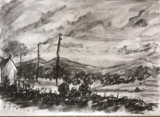
I then took one of these sketches and reworked using what I had learned from the sketching. I started with a blended background and worked with some smudging to create cloud shapes and some lifting out techniques. I then used the blunt side of charcoal dragging softly across the paper created the back hills. The middle ground trees I formed using some quick sketch marking (here I discovered by using a fingertip and dabbing the charcoal I got an affect of tree formation and varying my fingers I could get varying sizes) . I added the house smudging the white wall to get the dirty affect of old white wash walls and string lines for the chimney and roof. I left the field more or less bare to emphasize shape. I found if I have too many marks or shading then the charcoal smudges and there is no contrast.) I then worked on the near hedge here I attached the paper with sharp single marks smudging only at the base to create shadow. I finally dropped in the telegraph poles who act as a vertical to break up the piece and the wire leads the eye around the drawing.
Project 3 reflection.
Here I have found a number of things from working particulary on sketches. With a camera and a sketch pad and charcoal it is possible to create quite reflections of what you see and feel about a place. In all my work I have put everything that I have seen and beyond making sure the images has the 3 basic planes with minor adjustments the scene if treated with care to detail and tone most of the time the drawings work.
NOTE: For section 4 I was on holiday for 2 weeks in Cotswolds and left my sketchbook behind hence the stuck in sections into my work and the drawings are done on an a2 pad which was the only one I had with me.
Project 4 Perspective.
Perspective is something that I have always struggled with. The theory is reasonably straight forward but to get it correct is difficult. I own this book which I have always found useful.
I worked in charcoal in this exercise as I find it easiest at the moment and wanted to concentrate on getting angles correct. I worked on various sketches and taking pictures in a bar on a very hot day. The bar was dead so easy to sketch. I took the photo then sketched and tried to compare the angles imaginng the points carry on into the distance. I think the hardest thing I found was was trying to make sure all the angles matched. In corners of rooms where tow walls meet the two angles the wall come away should add up to 180 degrees but often unless you are looking at them dead on it is very hard to get this acurate.
In the end I settled on an almost 45 degree view of the entrance to the bar with the snooker table (not pool table strangley enough.) This had a number of elements that emphasize the angles with the old fashioned half wall wall paper to the right. The open door opening to a porch with opposite angles and the picture behind the door to the skirting board. I added the matt by the door as per instructured. Using charcoal again I tried to use tone to give depth to the picture and un-smudged hard lines and lifted highlights with the bright outside gleaming through the door.

I was also inspired by Van Gough’s bar painting and the strong feeling of perspective he achieved.

Project two.
In this I moved onto using perspective in buildings. The main issue I had here was that I wanted either to put too much detail or too much tone so that i did not concentrate on the angles enough. All of these drawings were done from real life however I wanted to try and move away from making a drawing to drawing just what I see. In the end the pieces that I have done I boiled down to very basics and tried to make sure that I understood the angles rather than making a pretty drawing.


Project Three
Here I moved onto arial perspective. I have some experience in providing this having done landscape painting for a short while. Here I produced 4 charcoal works. The first been a series a sketches of the lake at the back of our campsite. Using stronger bolder strokes for items closer to me and softer work towards the back. layering tonal values is also important, not just putting the darkest item closest but varying to avoid a cartoon effect. I am pleased with the image of the fence receeding into the distance. Here I decided to ignore totally the back ground beyond the trees and used an electric rubber to get sharp highlights in the foreground and a mixture of putty rubber and normal rubber to create highlights in the trees.


Exercise 2
This is a study of a town. Here I based myself in Winchombe a small Cotswold town. I started by walking around the town before settling at a table in the centre of the town at a local cafe. I wanted to capture the image of the town but within a hour I was seeing things that were not a chocolate box image that many of the tourists see. Indeed I was reading that average visitor spends less than 1 hour on average in each of the Cotswold village. I started sketching, working on the war memorial, to the old fashioned police light and to the crumbling facade of a building at the end of the road.
With these images I decided to try and place them in an order that still made sense in a way but was more abstact capturing the mood. I have always loved the art work of Agatha Christy’s Poiriot films had with Mr Suchet.

Combining this with the railway poster vintage style

I produced this which I have tried to capture all the elements although I am hopeful to produce a colour version.

Execerise 3.
This I worked in a limited pallette. For this I decided to use my charcoal and put watercolour over it to create
Exercise 4.
This I worked on statues. Here I sketched several statues but settled for concentrating on a statue that is famous in my home city, the Birmingham Bull Ring Bull. I worked quickly sketching the basic features and quickly worked out that I wanted to use my pencil to create the broad structures rather than just lines so I used the side of a pencil for broad brush marks.

Practice to Assignment Three.
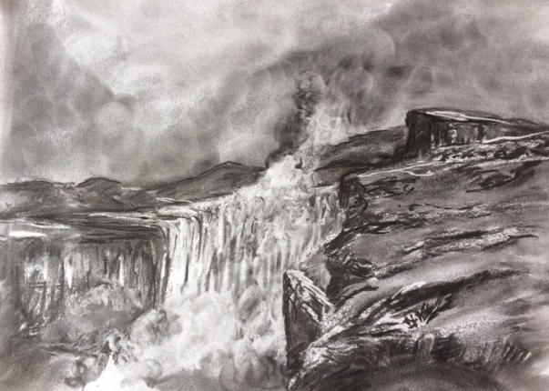
I started rather than working on one piece but to start I wanted to push what I could do with charcoal. I drew what ever I could see from the water in the lake to detail of a tree infront of tent to a quarry which had a waterfall plunging into it. I discovered that if I shaded and then using a finger pressed really hard instead of lifting the charcoal it drove it into the paper creating an interesting shapes. I experimented with sharp edges closer to the viewer and blended to soften out of areas I lifted used a rubber.
I did this to learn what I could do, I will continue to do this and have included the practices just for your information. Here is snapshot of some of the practices.


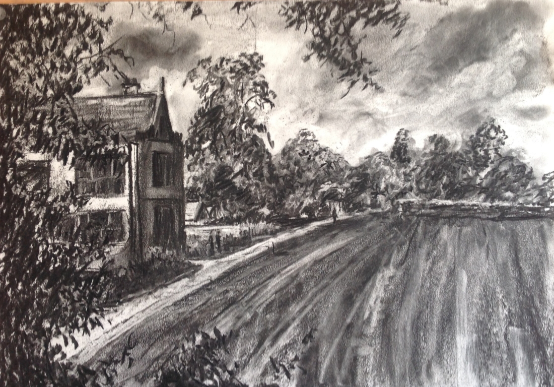
I decided on the image to use is a shot through the tress to a large country house. The lawn perfect mowed with stripes gives good perspective and the path leading away as a white stab into the heart of the drawing whilst the trees give good aerial perspective.
I sketched this several times (see sketchbook) and took several photos this is the one that I decided to work off.

I worked on a number of thumb nail sketches to work out composition. I added a slight curve to the path to lead the eye. I tried several placements of the house moving it closer to the centre however I wanted to avoid having eye level/horizon in the middle so that I kept the order of thirds in composition.
I also worked on keeping some interesting negative space reducing some of the tree at the front. I also worked to establish the darkest point and the highlights.


I was inspired to produce this painting by a painting I saw in Inspector Morse, “Who Killed Harry Field?” The painting was by Cezane and is called The Chateau Noir. I have tried to capture the brushmark of the closest tree in my work.